I was reading a book review recently of a piece of storytelling that I thought was divine. I read it in a single afternoon, surprised by how much I enjoyed the content. This particular reviewer was also surprised. They used a great many exclamation marks to make it clear they thought this story was going to be a romance, and not a deep book about a person learning that sometimes different is okay too. There was no smoochy smooch, and this warranted a rating of one out of five stars. My first thought took me off-guard, because it was about typeface. I pulled a face as I thought, “Pffft. The title was in a slab-serif, dude. Everyone know’s that’s not a smoochy romance font.” Taken aback by this seemingly profound knowledge I didn’t even know I had, I set about doing some digging. Now, before I unveil my findings, I should first mention that I am freakishly interested in things like this and even have a font identifying app on my phone because sometimes I see a sign and my immediate reaction is, “Dangg, there’s a typeface I could marry” and not “OMG! The bridge is out! We should probably not walk over it because certain death awaits!” With that in mind, here’s the dealio with typefaces for titles of books (if at any point you get confused refer to here because this is the best infographic on font ever):
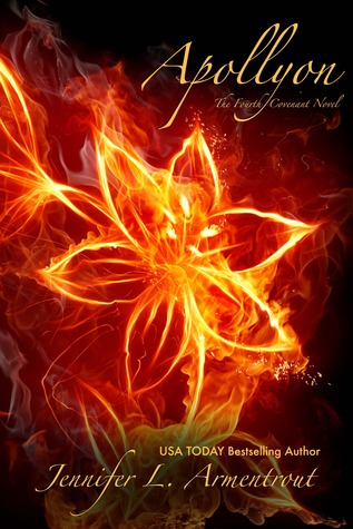
1. Slab-serifs: A serif is that weird little tick or kick that happens when you write a letter on the page. Computers mimic that in typefaces to make things easier to read in print. Serif fonts (like Times New Roman) are like dogs with tails. They have tails. That is the dealio with serifs. So what are slab-serifs? Well they’re just serifs that are, among other things, very square. In my bookshelf, and in my omg I must read this imaginary bookshelf too, I’ve found that slab serifs tend to be used for books that can have romance but are more about a journey or adventure than just that. These journeys ultimately change the main character’s life, and maybe even the world. I can’t believe I never noticed before, but the fabulous Veronica Roth’s Divergent series is clad in a slab serif that is gorgeous. Observe:


2. Serif: More romance driven plots tend to have pure serif or handwriting serif typefaces, they look fancy and regal and swirly (I should mention not all serif fonts are romancy fonts, as slab-serif is a subset of serif). The swirlier the title, the more smooching to be expected within the book (although this changes if things are set in the future, not sure why). The more serious (and less swirly) the title, the more likely it will be a historical fiction novel and have minimal smooch. Or, at least, a lot of death and goblin farts to accompany the smooch.

NB: there are some exceptions to this rule par exemple Fifty Shades of Grey, which is in a super non swirly font but, disappointingly, has minimal goblin farting and almost no epic battle scenes. A lot of the super swirly titles were a little ohh la la for this post and the zombies complained and I had to delete them but believe me, the titles can be very swirly. Also, note that while there are minimum goblins, Forged by Fate has equal parts romance equal parts THOR in it, resulting in awesome. Let’s take a look:


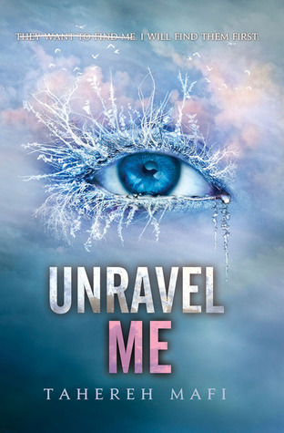
3. Sans serif: This means without serif, so the typeface is straight and clean and very modern looking. Fab for online reading, but not so great for reading blocks of text on paper. It seems that sci-fi, dystopian, and alien books like to use this font. I love all of those kind of books so that is super fab to me!


0 Comments
-
-
Mia Hayson
I designed the cover for my mystery novel, Tainted Souls. (Download the e-book for free!) Since I did it on the cheap, I was restricted to fonts in Microsoft Word. I chose Tempus, a sans serif with a sort of vaguely Egyptian look (though I really wanted Babylonian).
-
Mia Hayson
This is one of the most fascinating blog posts I have read in a long time. I'm already obsessing over covers because of Maureen Johnson's cover flip and now I will obsess over the fonts too! Love it 😀
POST COMMENT
Related Posts
How to survive your first book (robot uprising)
Wih this time of year comes a lot of promises we make to ourselves. We promise to not eat totally all of the cakes in one sitting, or to stop completely drowning oneself in maple syrup or not to kill all the characters in your current draft etc etc. I’ve heard a popular one is […]
I READ A BOOK: The History of Love by Nicole Krauss
We don’t do many book reviews over here do we? Mmm? I think, usually, well first off I am totally not a pro at reviewing. I don’t have le words. Hilarious. When I love a book mainly I am just reduced to single word sentences like, “ASDFGHJKL” and “AHHH. FEELINGS.” So! Mm! This is a […]
Let’s Get Down To Business
A few weeks ago, maybe a month even, I happened upon author, extraordinaire, and genuinely kind human being Tommy Donbavand thanks to the power of twitter. The thing about Tommy is he’s battling cancer right now, like genuinely as I type this the game is afoot. I know this because he blogs about it every single day — […]
Three Years, Four Thousand Miles & One Thought: Harassment
I’m paraphrasing but reading recent posts on harassment and the scores of comments beneath them recently there was one that really struck me. It spoke about giving up writing because of all that has happened to them. Giving up because their joy had been tainted. It never occurred to me when writing about our ghosts […]
Reason #256 why books have a future
Seriously. Bath readers will never abandon the book. We are finnnee, at least for the moment. I mean, when they invent a waterproof eReader things will get interesting but until then! Stay safe! Any other issues you’ve noticed with either type of reading platform? I find when reading in bed? If I drop a book […]
New Year, New You, New Novel?
It’s a New Year! All these new ideas swirling in your head! Each of them begging to be written and somehow brought to life. There’s not enough time in the day to write every idea you ever have – we all know this in because in some shape or form, we’ve all tried to at one point. So how can you deal
Mia Hayson
I love this post! Thought-provoking… Now I want to dissect the font on every book I've ever read. Always enjoy your graphs. Christy