They say you should never judge a book by it’s cover but there is something appealing in doing just that. Only to books. Only in the depths of night. Only when the fancy takes me. I like to look at the trends of book covers in YA and think about what it means. Every year there seems to be a thing. This year there are lots of things. I love all the things!
Here are some things that are fresh off the catwalk of 2016, hot out of the bookshelves of the cities coming straight to your door soon or now(ish)!
[su_spoiler title=”disclaimer” style=”simple”]other than reading an awful lot of books I am in no way an expert on trends maybe there is somebody somewhere who is en expert on book covers and creates the trends and if so I would love to hear from them as I love covers![/su_spoiler]
[su_spoiler title=”also” style=”simple”]i have just discovered i can make these boxes on the blog omg! the wonders of the modern age! expect at least 25% more boxes in everything i write from now on[/su_spoiler]
[su_spoiler title=”you should know” style=”simple”]you are the master of your own story <3[/su_spoiler]
[su_spacer]
[su_divider top=”no” size=”1″ margin=”10″][su_divider size=”1″ margin=”10[/su_divider][su_spacer]
This has been a trend for a few years now. Maybe it’s that blue speaks to our inner YA souls, as it screams of boundaries and conflict and of that murky in-between place that dark things can inhabit. But it can also scream of love and endless skies. I love beautiful blues. My favourite colour is orange, something in me speaks to that colour, but blue books feature heavily on my shelves.
Special shout outs go to On The Edge of Gone, We Are The Ants (which is actually still on my tbr pile rn but it is edging ever closer and I cannot wait to read it! I’ve heard great things) and Swimming in the Monsoon Sea. Just look at those gorgeous blues there! We’re swimming in an endless sea of quality covers.
[su_divider top=”no” size=”1″ margin=”10″][su_divider size=”1″ margin=”10[/su_divider][su_spacer]
I love the daring reds and firey book covers of 2016! For those not totally into the blaring colours of red and orange gold seems to be a strong theme this year (although how can you not be blown away by the red in Paper Hearts?), look at it swishing its way down the catwalk on The Last Star over there. Looking good *finger guns*
[su_spacer][su_divider top=”no” size=”1″ margin=”10″][su_divider size=”1″ margin=”10[/su_divider][su_spacer]

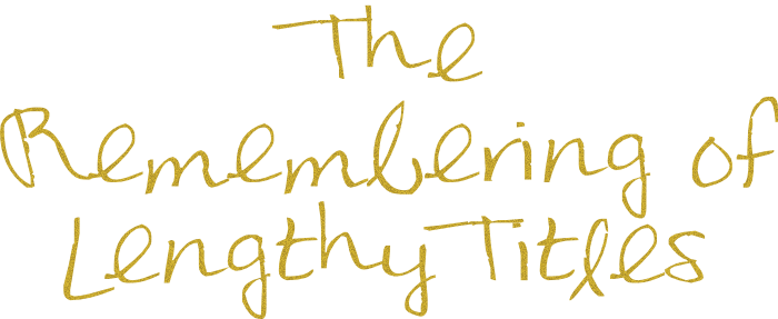
This happened gradually and then all at once. Welcome to the renaissance of the long title! I adore long titles, with their whimsy and often cryptic meaning. Some titles are longer than others but all of them are beautiful! I find them intriguing. A few years back during the daring dance of the dystopias we had short cutting titles being hot (I think they still are to some extent?) so it’s fabulous to see lengthy titles making a comeback!
[supsystic-gallery id=8 position=center]
Best Dressed goes to Aristotle and Dante Discover the Secrets of the Universe by Benjamin Alire Sáenz because what a gorgeous cover but also that is honestly the longest title I’ve read for a long time! Wow! On Goodreads it says “Aristotle is an angry teen with a brother in prison. Dante is a know-it-all who has an unusual way of looking at the world. When the two meet at the swimming pool, they seem to have nothing in common. But as the loners start spending time together, they discover that they share a special friendship—the kind that changes lives and lasts a lifetime” Colour me intrigued!! I really want to read this.
[su_spacer][su_divider top=”no” size=”1″ margin=”10″][su_divider size=”1″ margin=”10[/su_divider][su_spacer]

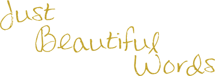
From Rebel of the sands to Beautiful Broken Things, these covers feature beautiful typography that, quite rightly, take centre stage. I like to look for clues in these covers, and am delighted when the clues are woven into the plot. I honestly can’t choose a best dressed here because I think they are all so fabulously made! I really adore the metallic theme of some of these — there’s a special place in my heart for the foil beneath hardback cover slips so maybe that’s why I adore the colours so much!
[su_spacer][su_divider top=”no” size=”1″ margin=”10″][su_divider size=”1″ margin=”10[/su_divider][su_spacer]
 I think this one is an emerging trend. I’ve only seen it on a few books so far but it’s an interesting one! Paper Butterflies looks so interesting with that tag line between the title. I’ve seen one other book like this (although rn I can’t remember the title!) and I love it! I love the duality of reading between the lines.
[su_spacer][su_divider top=”no” size=”1″ margin=”10″][su_divider size=”1″ margin=”10[/su_divider]
What cover trends are you seeing? Don’t you love covers? I can’t help myself! They house such wonderful worlds and stories! They’re the gateway to other worlds!
0 Comments
-
-
Mia Hayson
It is isn’t it? I love pretty words 😀
-


Loni Townsend
The Year Of Lightning is really cool, but I think I like the Beautiful Words ones even more. Typography is wonderful.